Another NASA Logo Ripoff

North Korea appears to ape Nasa with space agency logo, Guardian
“The choice of a globe as the emblem for North Korea’s space agency expresses the country’s ideal of peaceful exploration, explains the Korean Central News Agency. The blue rings, it adds, represent satellites, and the constellation of stars shows the desire to “glorify Kim Il-sung’s and Kim Jong-il’s Korea as a space power”. However, the state news agency neglects to mention one glaring thing: the new logo looks a lot like that of Nasa, the space agency of Pyongyang foe’s the US, right down to the blue globe, lettering and swooshed ring.”
– NASA Logo Appears On Lady Gaga’s Head (Update)
– New NASA Logo Designs


At least they had enough common sense not to imitate the “NASA Worm” logo.
Hey, I like the worm too.
FYI: the big dipper used by North Korea is also that used by the International Academy of Astronautics on their pin…
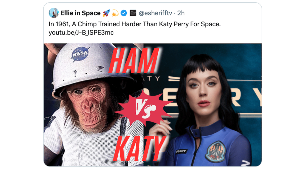
North Korea copies the NASA logo, China copies the NASA VAB, Iran copies NASA’s monkey in space. The only one not copying NASA these days is NASA.
“Foe”
Guardian, you are giving NADA (ROFL) too much credit.
Thou, to be fair, a lot of space agencies imitate the meatball.
In Portuguese, and Spanish “NADA” means “NOTHING”.
“expresses the country’s ideal of peaceful exploration,”
…
It almost has the feel of an April fools joke.
Imitation is the sincerest form of flattery.
the ESA, CSA and Roscosmos logos are all also circular!
NK is just imitating everyone!
http://2.bp.blogspot.com/-x…
I don’t see how that’s a copy. The Earth is round so it’s really a copy of the shape of the planet. Things that are lunched in space fly around the Earth.. so that’s not a copy. From space the dominate color of the Earth is blue.. so I don’t see that as a copy. They didn’t copy the chevron or NASA font. I think it’s a bit of a stretch to say “RIPOFF”
However, NK is fairly notorious for ripping off western (mostly US) brands and logos. And this one has the smell of one of those fake-space-agencies in near-future SF movies (ah, good old IASA…) when they couldn’t get permission to use NASA’s logo.
http://i.dailymail.co.uk/i/…
http://i.dailymail.co.uk/i/…
I think there is a big difference between the logos vs a soda bottle with the same EXACT color and font as Coke. Far cry from the Logo. Canada is a well know rip-off as well if the criteria is that low for steeling the NASA logo 😉 http://upload.wikimedia.org…
I still think China’s is the best, Starfleet logo for the win