Worm Watch

NASA’s ‘worm’ logo lay dormant for 28 years. So why are people so obsessed with it?, Fast Company
“Fast-forward to 1992. As Danne tells it, the logo was retired by executive decision. The new NASA administrator at the time, Dan Goldin, allegedly didn’t like the worm and wanted to bring back the meatball as the primary logo. According to Danne, it was quickly phased out. NASA confirmed it was an executive decision but didn’t have any more details about Goldin’s motivations.”
LOST IN SPACE; Meatballs Devour Worms!!, New York Times Magazine (1999).
“For the past six years NASA has been trying to wipe out the tubular red logo (”the worm”) that has symbolized space exploration since 1975. The chief exterminator is Dan Goldin, NASA’s administrator, who says that the original 1958 emblem (”the meatball”) better commemorates the program’s mission. But wasting the worm, which has adorned everything from welcome mats to wind tunnels, is taking longer than Goldin would like. Keith Cowing, an ex-NASA payload manager who documents worm sightings on the NASA Watch Web site, raps Goldin’s subordinates for obsessively hiding the worm from the boss. A NASA spokesman protests, saying the agency is worming itself — harmlessly — over time (old letterhead will be used up, etc.): ”If someone decides they better go and eradicate this, that or the other thing, it’s not because of Goldin.”


Get rid of the worm!
It is back – to stay!
But more important, “No worms with meatballs, and no meatballs with worms!”
As long as the current CTO at Hawthorne is at the helm. There isn’t a way to get rid of the worm. Expect to see the worm display on the Moon and Mars soon.
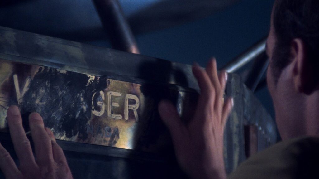
Those were the days where NW readers can submit areas where the worm still exists, and numerous black rectangles on buildings here and there. Keith summed it as “kind of like Captain Ahab and the whale.”
I have to go find the Zip drive (remember them?) that has the Worm Watch archive and repost them. A lot of early NASAWatch stuff got lost 20 years ago when we did a reorganization of the website.
The iconic NASA round, blue logo incorporates it all: stars, an orbit, the vector implying motion – the “worm” might as well be the swoosh